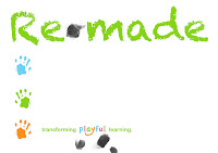
The above image is the most recent iteration, going with a 'less is more' approach. Simple. Clean. I hope! Keeping the playful logo which was a basic photoshop font with a brush of orange on the y tail. Does it look cheap? Hmmm.
Using fingerprints as bullet points instead of hands. Feedback has been that both hands and print shouldn't be used together, and I think I agree. Too childlike seeing as this will be marketed at , governing bodies, schools and teachers, not the children themselves!
First iteration. Liking the children's hand look. Smudging all over the place to create fingerprint effect.


No comments:
Post a Comment